New Google Analytics UI – A Downgrade
![]()
Google Analytics is updating their user interface and report presentation, and just as I feared, some of it is a downgrade in usefulness. I’ve been using metrics/analytics packages for ages now. At my old company many years ago, I helped set up and use NetGenesis NetAnalysis product to generate reports from our log files. We later used SurfAid and Coremetrics and Omniture. We also built our own, in-house reporting system to supply stats that we couldn’t get via off-the-shelf packages, and I personally programmed some of those and managed other developers who worked on them as well. So, I’m pretty familiar with analytic reporting systems, and I know what’s possible in designing them. I don’t like some of Google’s changes to their service.
Google Analytics has done what I’ve seen so many other analytics companies do: they’ve dumbed down the reporting presentation capability of their service, apparently gearing it primarily toward less-technical marketers and people who run Google ads on their sites or who advertise through Google. The trend with all these analytics companies seems to be to evolve solely towards generating report charts for marketing departments, focusing mainly on conversion statistics and prettified reports that have extracted the ability to easily see quantitative amounts over timeperiods, lulling the brain with pretty colors and obsessing more over slick Ajax/browser interactions than delivering statistical content in a meaningful way.
In their blog, Google even highlights/links to a ClickZ article which says that the new version was built for Search Marketers.
There are other people who have other interests in the reports than just marketing! These reports are vital for usage analysis and usability research. How about just trying to gage the popularity of a given page? Why is there sometimes such devotion from divorcing people from the raw figures found in the usage tracking logs?!?
One immediate downgrade between the new system and the old is that you can’t view trendlines of Visits simultaneously with PageViews. I want to see the raw numbers of both, in conjunction with each other, not just PageViews per Visit! The new interface lets you only view one or the other, not at the same time.
They’ve messed up the labeling of Referrer metrics, too. In my opinion, it’s misleading to label a report “Referring Sites” and not have it include all. In this report, “Referring Sites” doesn’t include referrals from search engines – you have to go under “All Traffic Sources”. I see merit in having a separate report just for Search Engine Referrals, but not for “Referring Sites” with SEs extracted. Regardless, the label is misleading for anyone with any length of background in internet IT.
The listing of keywords which referred traffic through individual search engines is very cool!
In like vein, why not provide top keyword ranking numbers, similar (and expanded) to what is reported in Google Webmaster Tools?
The worst gaffe of the new UI is in the display of geographic visit data. In the old reports, you could glance at a world map and little dots would show how much traffic came from what areas in the world. Those dots could vary in size to give a quantitative indication of how much traffic came from each area. The new maps dumbed things down so that you can’t easily see how much traffic came from what area in the world without mousing over areas, nor can you tell how it was distributed in each area without zooming down to areas of the map. Compare:
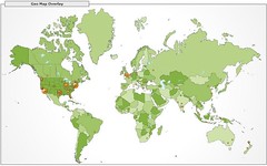
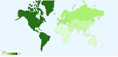
Using color scales is really hard on users to quickly scan and understand the geographic charts. Can you easily tell what each country’s shading goes with which color scale shade in the map key?!? No, most users wouldn’t be able to. Mousing over to get the number doesn’t help, either — the point is to be able to easily see amounts across the board and be able to compare them all at once — not one at a time. Can you remember the numbers from Oceana, Africa, Asia, Europe, North America and South America — all at the same time?!? This isn’t a game of Concentration.
Check out this closeup map of the States:
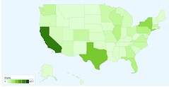
Google Analytics Closeup Map – United States
By viewing this, can you easily view this and tell how many visits came to your site from the various cities throughout the country? No. This is an even worse game of concentration than the worldwide map. Instead of a few continents, try remembering the quantitative amounts for all 50 states at once! Not to mention, can you tell which shade goes with each scale box?
Over time, a user might be able to memorize the scale shades, except — the scale itself is variable, according to the site’s traffic! So, one week the second-to-lightest box MIGHT be representing 1,000 and another week it could represent 10,000. Oh, and it’s not set at even numbers. Oh, and I could just WISH that the scale fell into nice, even numbers! But noooooo! They tell you what the lowest and highest numbers on the scale are, but NOTHING in between! News flash: I’m a pretty clever/capable guy, but I cannot MENTALLY INTERPOLATE each of the numbers in a scale between say, 48 and 1,853! Who can?!? Why should I? The whole point of using charts is to make data readily understandable through visual presentation, so why should I have to work harder to comprehend the data?
I liked the early/current version of Google Analytics, and this new version comes up a bit short for me, particularly with the geographic charts, so I’m going to have to pan it.
I hope they’ll continue to support the legacy interfaces quite a while longer, until they improve some of these issues I’ve noted herein.
Possible Related Posts
Posted by Chris of Silvery on 05/18/2007
Permalink | |  Print
| Trackback | Comments Off on New Google Analytics UI – A Downgrade | Comments RSS
Print
| Trackback | Comments Off on New Google Analytics UI – A Downgrade | Comments RSS
Filed under: Analytics, Google, Tools, Tracking and Reporting Analytics, Google-Analytics, Internet-Statistics, Statistics


No comments for New Google Analytics UI – A Downgrade
No comments yet.
Sorry, the comment form is closed at this time.