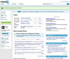
So, I’m at the SMX West [1] conference tonight, hopping around networking with people and every so often updating my Flickr pix [2] or sending work emails when I noticed that LinkedIn [3] is apparently beta-testing a new homepage layout on me. Check out the screengrab of what I see now when I login to LinkedIn:
So, they want feedback on their new design, so I’ll give it here.
I’d assume when they moved some of the header area navigation down to form the left sidebar, that this should open up room for the rest of the body content on the page to come up closer to the top of the window. As you can see from my screen-grab, this isn’t what happened.
Some of the general features they’ve been adding recently have pushed down what I considered to be their core content — the main reason I use their site — to far lower on the page and “below the fold”.
Pushing Inbox content to the front page and the news items are pushing my Network updates way down on the page. The network updates are one of the main reasons I’m coming here, so this is irritating. News I already get from elsewhere, and the emails are all going into my regular email in-box, so why are these presented as though they’re the main content of LinkedIn when I arrive on their homepage? Maybe email should flow to the top if you have opted not to have the notes mailed to your email address.
The little green checkmark and message box seem to take up more prime real estate, pushing everything down.
Why wouldn’t Answers also be found in the little left sidebar?
Aside from the bad prioritization that pushes their unique content to the lower part of the page, the colors and layout seem otherwise fine.
I’d note that the tabbed top of the old design seems actually preferable to this, because the main content navigation seems pushed down on the page for some of the top sections. Bringing that stuff down lower on the page seems to squeeze other content, making everything scroll longer than necessary.
Bottom line: I mainly use LinkedIn to research info about people, to network with people, and to keep updated info about my professional contacts. So, other stuff is of lesser importance to me, and should be made less prominent on my LinkedIn homepage. Don’t make me scroll if I don’t have to!