New Google Analytics still poor experience
Back in May I gave the new Google Analytics design a negative review, primarily because it made it impossible to view at a glance how many people in what area of the world are viewing your site. I’d also panned it for making one unable to view both Page Views and Visits together simultaneously.
![]()
Despite my griping, they rolled it out anyway with this feature unchanged, and they made it impossible to view the data through the old UI as of July 19th. They report adding more requested features, but how about adding back some of the functionality they destroyed? Perhaps they’re more involved in getting the daily data processing issues resolved, and admittedly I’d agree that would surely be a higher priority. I’m just still flummoxed because it seems so unnecessary to revoke good functionality in the first place.
I’ve found yet another irritating change that I consider to be even more serious: you apparently can’t view the data in monthly units – only daily:
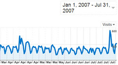
Why did they revoke the ability to visually compare monthly periods?!? Most search marketers I know like to compare overall figures from month to month since it tends to reduce some of the spikiness of short-term bursts, and lots of folks are using monthly billing cycles and such.
If I’m mistaken and there’s some where to set the period to display monthly, I hope someone will let me know. I hunted and hunted, and checked their help section to no avail. If they really did revoke monthly display, I can only reiterate further how bad this so-called “upgrade” really was! All glitz with little beneficial substance.
The Analytics team should borrow some of the members of the Google Maps team, since comparatively the Maps team seems to get it right a lot more lately.
Possible Related Posts
Posted by Chris of Silvery on 08/01/2007
Permalink | |  Print
| Trackback | Comments Off on New Google Analytics still poor experience | Comments RSS
Print
| Trackback | Comments Off on New Google Analytics still poor experience | Comments RSS
Filed under: Analytics, Google, Tracking and Reporting Analytics, Google-Analytics, Internet-Statistics, Statistics
New Google Analytics UI – A Downgrade
![]()
Google Analytics is updating their user interface and report presentation, and just as I feared, some of it is a downgrade in usefulness. I’ve been using metrics/analytics packages for ages now. At my old company many years ago, I helped set up and use NetGenesis NetAnalysis product to generate reports from our log files. We later used SurfAid and Coremetrics and Omniture. We also built our own, in-house reporting system to supply stats that we couldn’t get via off-the-shelf packages, and I personally programmed some of those and managed other developers who worked on them as well. So, I’m pretty familiar with analytic reporting systems, and I know what’s possible in designing them. I don’t like some of Google’s changes to their service.
Google Analytics has done what I’ve seen so many other analytics companies do: they’ve dumbed down the reporting presentation capability of their service, apparently gearing it primarily toward less-technical marketers and people who run Google ads on their sites or who advertise through Google. The trend with all these analytics companies seems to be to evolve solely towards generating report charts for marketing departments, focusing mainly on conversion statistics and prettified reports that have extracted the ability to easily see quantitative amounts over timeperiods, lulling the brain with pretty colors and obsessing more over slick Ajax/browser interactions than delivering statistical content in a meaningful way.
Possible Related Posts
Posted by Chris of Silvery on 05/18/2007
Permalink | | Print
| Trackback | Comments Off on New Google Analytics UI – A Downgrade | Comments RSS
Filed under: Analytics, Google, Tools, Tracking and Reporting Analytics, Google-Analytics, Internet-Statistics, Statistics

