Origins of the Google Logo
Wired today has an article on the preliminary Google logo designs – something that aspiring internet commercial artists should check out.
One of the designs is obviously referencing Op Art to give a modernistic feel. Another treats the second “O” as a sort of loose metaphor for the web or to symbolize multidimensionality. Yet another uses a magnifying glass for the second “O” — a much more literal representation for a search engine which we used to see really frequently in the earlier years of the internet (remember stuff like the old WebCrawler logo?).
I think the version they ultimately used is the best/strongest one, even though I think it likely owes something to eBay’s playful/colorful logo.
The original designer of the Google logo was Ruth Kedar, an assistant professor at Stanford at the time. She noted, “I had no idea at the time that Google would become as ubiquitous as it is today, or that their success would be of such magnitude”.
Ubiquitous it is indeed. As I noted two months ago, the frequency of use of the Google logo and its familiarity within the popular culture have been growing to the point of actually being a little bit of a danger from the viewpoint of being able to protect the marks as intellectual property.
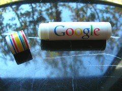
The Google name is on everyone’s lips.
Copyright Silver Smith 2007. All rights reserved.
Possible Related Posts
Posted by Chris of Silvery on 02/12/2008
Permalink | |  Print
| Trackback | Comments Off on Origins of the Google Logo | Comments RSS
Print
| Trackback | Comments Off on Origins of the Google Logo | Comments RSS
Filed under: Design, Google Commercial Art, Google, Google-Logo, Graphic Design, Logo, Logos


No comments for Origins of the Google Logo
No comments yet.
Sorry, the comment form is closed at this time.